We build a lot of websites for heating engineers and plumbers, and the pattern is the same every time. The sites that bring in steady calls are rarely the fanciest. They are the ones that make a stressed customer feel, within a few seconds, that they have found the right person.
This is what we focus on when we design for heating businesses, and what you can check on your own site today.
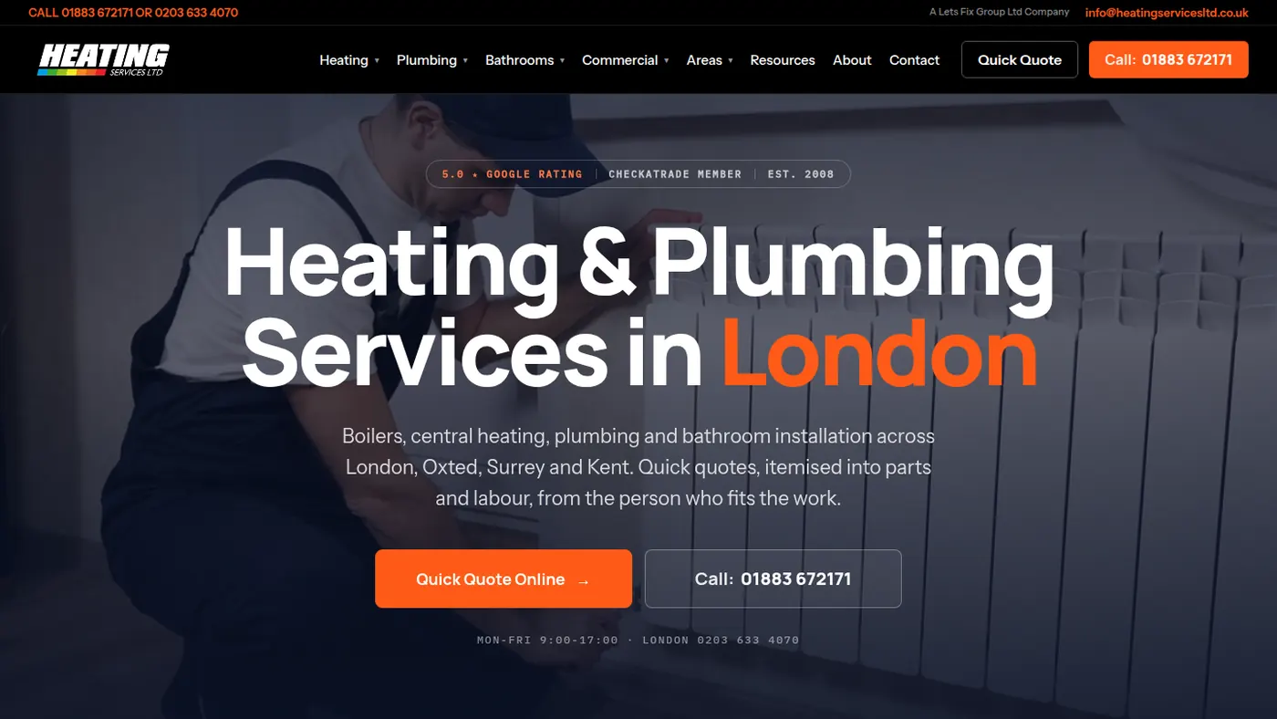
The first screen has one job
When someone lands on your homepage, the first screen decides whether they stay. It should say what you do and where, in words a customer would use: "Boiler repairs and servicing in Leeds", not "Delivering thermal comfort solutions". It should show one clear button to request a quote, a phone number they can tap, and a sign that other people trust you, such as your rating.
That is all it needs to do. Sliders, long mission statements and stock photos of smiling families push the useful parts further down the page, where fewer people ever see them.
Lead with the jobs that pay
Most heating engineers want more of certain jobs: new boiler installs, system upgrades, heat pumps, landlord gas safety certificates on a regular cycle. A website can tilt your enquiries towards those jobs if you let it.
Give each of those jobs its own page with its own heading, a short explanation of what is involved, what affects the price and why customers choose you for it. Link to those pages from the homepage first. Small repairs will still come in, but the bigger jobs get the prominence, and Google gets a page it can match to each of those searches. That is the core of inbuilt SEO.
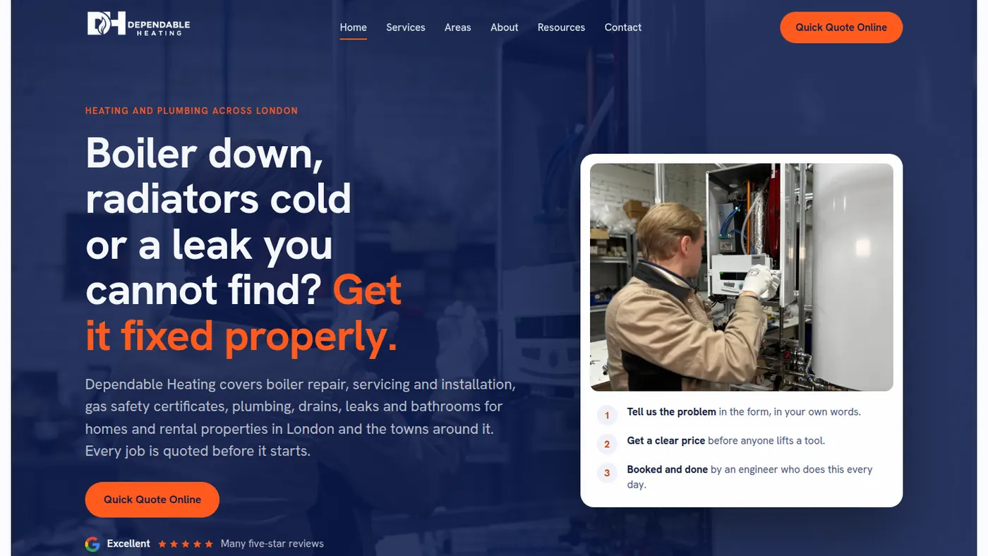
Trust signals heating customers look for
Letting someone work on the gas supply in your home is a big decision. Customers look for reassurance, and a good heating website puts it where they cannot miss it.
- Gas Safe registration, with your number, near the top of the page and near every form.
- Reviews with names and towns, pulled from your Google profile and kept up to date.
- Manufacturer approvals and guarantees if you have them, stated plainly.
- Real photos of you, your van and your installs. Customers can tell the difference from stock.
- A named person. People would rather call Dave than "the team".
A quote form built for a cold house
Someone with no heating in January will not fill in a twelve-field form. Keep it to the basics: name, phone number, postcode and a box to describe the problem. You can ask about boiler make and model on the phone.
Put the same short form on every page, and make every "Get a quote" button on the site scroll straight to it. It sounds small, but removing the hunt for the form is one of the most reliable ways we know to turn visits into enquiries. Every enquiry then lands with you already knowing the job and the area, so calling back is quicker.
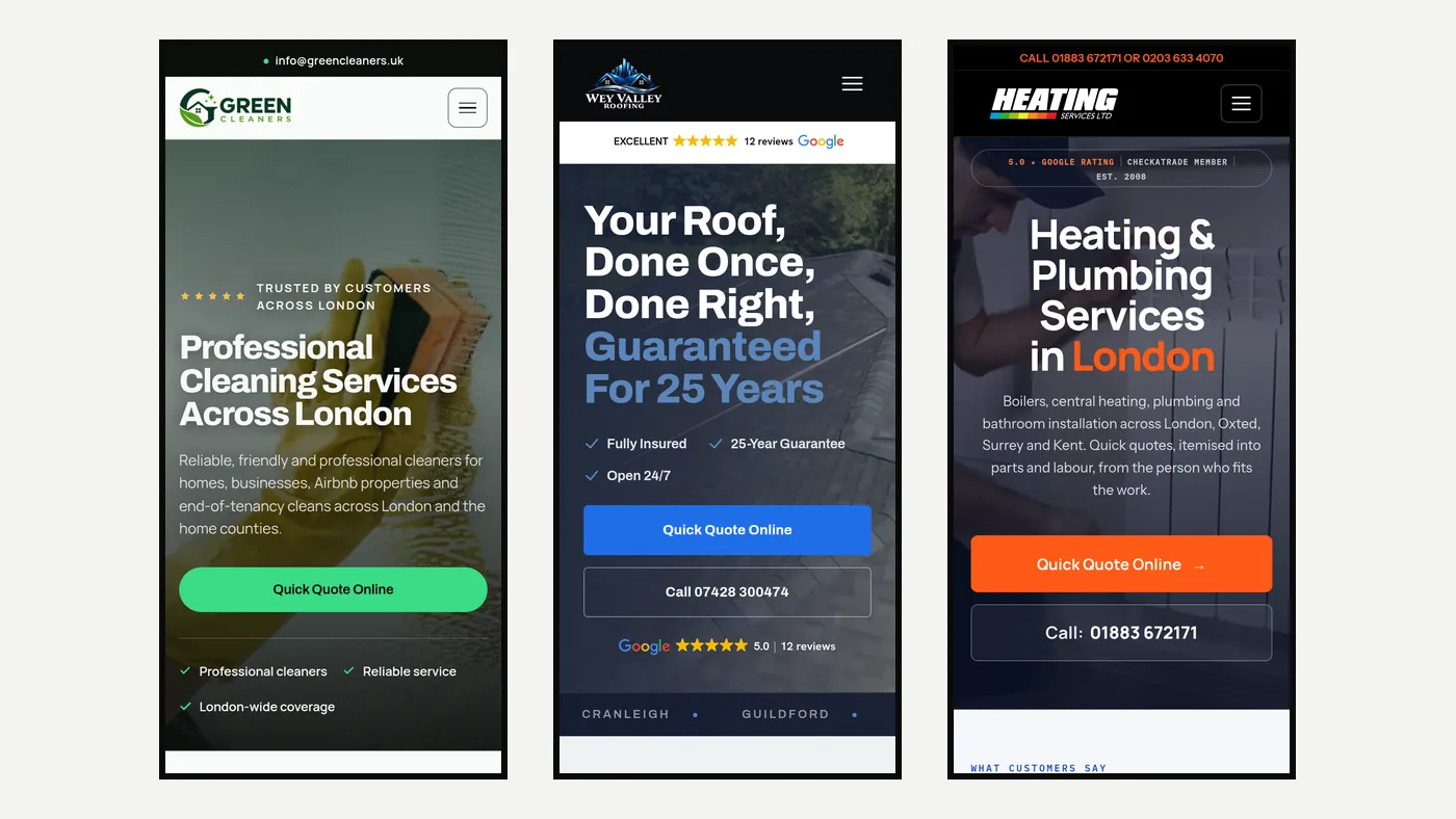
Built for phones, because that is where boilers break
Most heating searches happen on a phone, often in a hurry and sometimes on a weak signal. A site that is slow or awkward on a small screen loses those customers before they have read a word.
We design every page at phone size first and check it at 360 pixels wide, the width of a small Android handset. Text is large enough to read without zooming, buttons are big enough for a thumb, and the phone number is always one tap away. We build fast static sites with no heavy page builder underneath, so pages load quickly even on 4G.
Seasonal pages and the winter rush
Heating work is seasonal, and your website can follow the seasons. Before winter, pages on boiler servicing and breakdown cover give people a reason to book early. In the spring and summer, installs and upgrades are easier to schedule, so that is the time to push them.
Short, useful articles help too: what to do if the boiler pressure drops, how often a boiler should be serviced, what a landlord gas safety check covers. They answer real questions customers type into Google, and each one can point readers to the service page and the quote form.
What does not get you calls
Some things look good in a design meeting and do very little for enquiries: autoplay videos, animated sliders, pop-ups asking for an email address, and pages of text about company values. Long forms, hidden phone numbers and a contact page that is only reachable from the footer all quietly cost you work.
If your current site has a few of these, you do not always need a rebuild. But if it is slow on a phone, has no page for the jobs you want, and does not show your registration and reviews up front, a new site built around those basics will usually bring in more calls. Tell us about your business using the form on this page and we will give you an honest view.